What's The Difference Between App Design And Web Design
What I've learned designing for websites vs. mobile apps
![]()

Hi I'm Anya and I'm a Product Designer focusing on the My BT app. I've been at BT for just over 2 years, joining as a Junior Visual Designer, straight out of University. During my second week, it was announced BT would go through a digital transformation and my role would become a Product Designer (sounded nifty, but a little daunting as I wasn't really sure what one was at the time!). The restructure has meant I have been able to own digital journeys and make a positive impact for our users.
When I was offered the opportunity to move teams and focus on the My BT app I jumped at the chance of a new challenge. As well as getting to know the new team and ways of working, I also quickly learnt there are a couple of key differences between creating a responsive web design and a mobile app experience.
There is a great deal of cross over between designing for web and apps. We still want customers to have a consistent experience and both can be used on mobile and tablet devices, so we use the same grids, typography, and colours (to name a few) that you would see on our website, however, here are just a few things that we need to consider when designing for our app…
What is the My BT App?
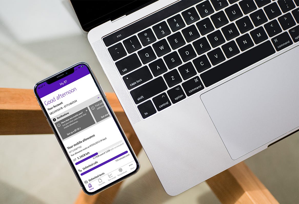
Our ever-growing app has some great tools to allow customers to set up their devices, manage their usage, pay bills, track orders, and get useful help and support on the go. We're a touchpoint in many user journeys so we have the unique opportunity to get involved in lots of projects while also driving our own optimisations. We are currently working to bring more native functionality into our app, however, we do still rely on some web views. By bringing the functionality into our app, it means we can make the pages consistent with the rest of the app, make use of our data to create a personalised experience, and we have more options in terms of visual and interaction designs.
Unique Operating Systems
Each operating system on the market comes with their own unique features and benefits, and our app is available for download on Android and iOS devices. We have a great team of developers who are platform-specific; however, as a product designer, we create designs that need to be developed and used by both operating systems. We don't want one group of customers getting a different experience to the other, but sometimes we need to design in a way that is sympathetic to the UI around our app: Where is the back button? What gestures do they or can they use? What is the format of the top bar? To gain a better understanding of these platform-specific components, I regularly use Apple's Human Interface Guidelines and Android's Material Design Guidelines. I've also found working closely with our developers has been really useful to understand the unique features we can make use of on both operating systems, and listening to their suggestions. Our developers have some brilliant ideas, so I highly recommend getting to know your developers and work as close with them as possible.
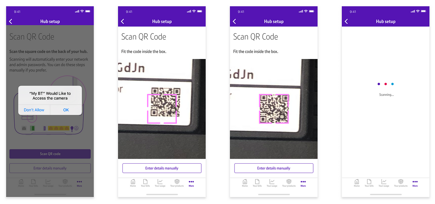
As I mentioned, designing for an app also means we have access to system unique features and resources, such as GPS and the camera function. A great example is during our Smart Hub 2 set-up, users are able to use their camera to scan the QR code on the back of their hub to automatically enter their network and admin passwords. This is a functionality only available within the app as we took the opportunity to make use of the system resources to improve the user's experience. By using the camera, users can now connect to their broadband faster, and reduces user frustration needing to read the small print on the back of their hub. The availability of different technology has allowed me to be more creative when thinking of solutions compared to when I was only working on websites.

Diversity of Devices
While responsive web design has allowed us to design for websites that cater to different screen sizes in a relatively easy manner, native mobile apps are a lot less flexible in that sense. I needed to take into account the diversity of devices when switching from web to mobile app design. When creating UI designs, I need to ensure components can be accommodated to a variety of screen sizes and resolutions, especially when dealing with text, images and containers.
When exporting assets for the web, I would often only need to export three different sizes: mobile, tablet and desktop; however, with an ever-growing market of smartphones and tablets available, each one comes with a different screen size, pixel density, and device orientation - however, after working with the developers to create a defined list of image densities for mobile, tablet portrait and tablet landscape, we are able to give the user the best quality image for their device. Having a clearly defined list of exports is really useful, so I can quickly export assets from Figma. For those that aren't aware of the different pixel densities, Apple and Android have some useful resources.
Gestures
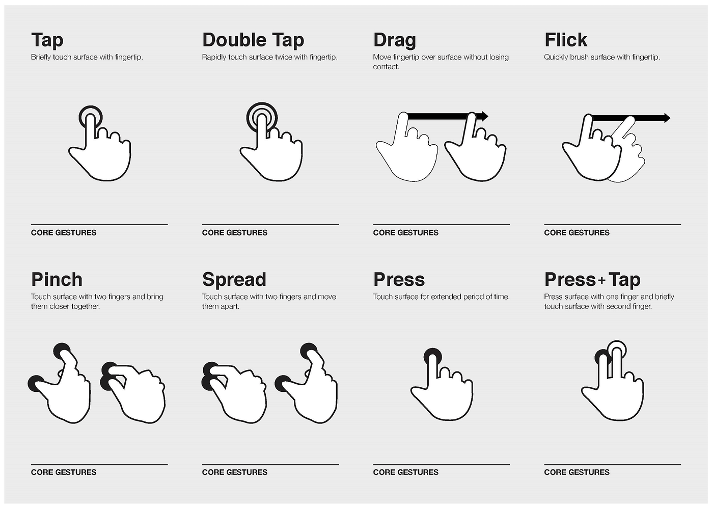
The gestures a user will use when using a website on their laptop and interacting with an app on their mobile will be very different. When using our app, I realised a majority of the gestures would be performed by the user's fingers (tap, swipe, drag, slide etc.) but they could also involve hand movements (shaking, tilting, moving, and rotating the device). I now need to think which type of gesture would be the most natural movement for each task a customer is performing — a consideration I rarely needed to think of when designing for the web. More often than not, it would be clicking or hovering with their cursor (although as we started to move towards a mobile first approach we did need to start thinking about other potential gestures). Gestures are a great function to help to free precious space in our UI that normally would have had a clickable button. The primary gesture we still use is tapping but we are currently exploring more places we can use the swipe movement to dismiss notifications, open menus, and navigating back a page.

Although I've learnt so much during my time on the app (and it's still less than a year!) I'm still learning more about app design, and the best practises — however, I love exploring the unique features the operating system can bring, and when the devs find new tools we can make use of — we're very excited about the potential of widgets so keep an eye out for ours!
Find out more about the My BT app >
What are your experiences of designing for apps vs. websites? Let us know below.
Photo by Tim Bennett on Unsplash
What's The Difference Between App Design And Web Design
Source: https://medium.com/bts-design-team/what-ive-learned-designing-for-websites-vs-mobile-apps-45a7e6ef35f0
Posted by: cartiertoloses.blogspot.com

0 Response to "What's The Difference Between App Design And Web Design"
Post a Comment